
A new name, everywhere at once.
In 2024, two banking and insurance offices became one: Thruvo. We put the new name everywhere, from the logo to the website.
- Client
- Thruvo
- Year
- Since 2024
- Format
- Logo, visual identity and website
How do you give a new name a face, so customers recognize it at the office, on the road and online?
Logo, visual identity and website
Two offices, one name.
Ericx-Van Den Wouwer and Curos joined forces as Thruvo, with offices in Overijse, Hoeilaart and Tervuren. The owners wanted a name and a look that customers of both offices would feel at home with.

The t of thruvo.
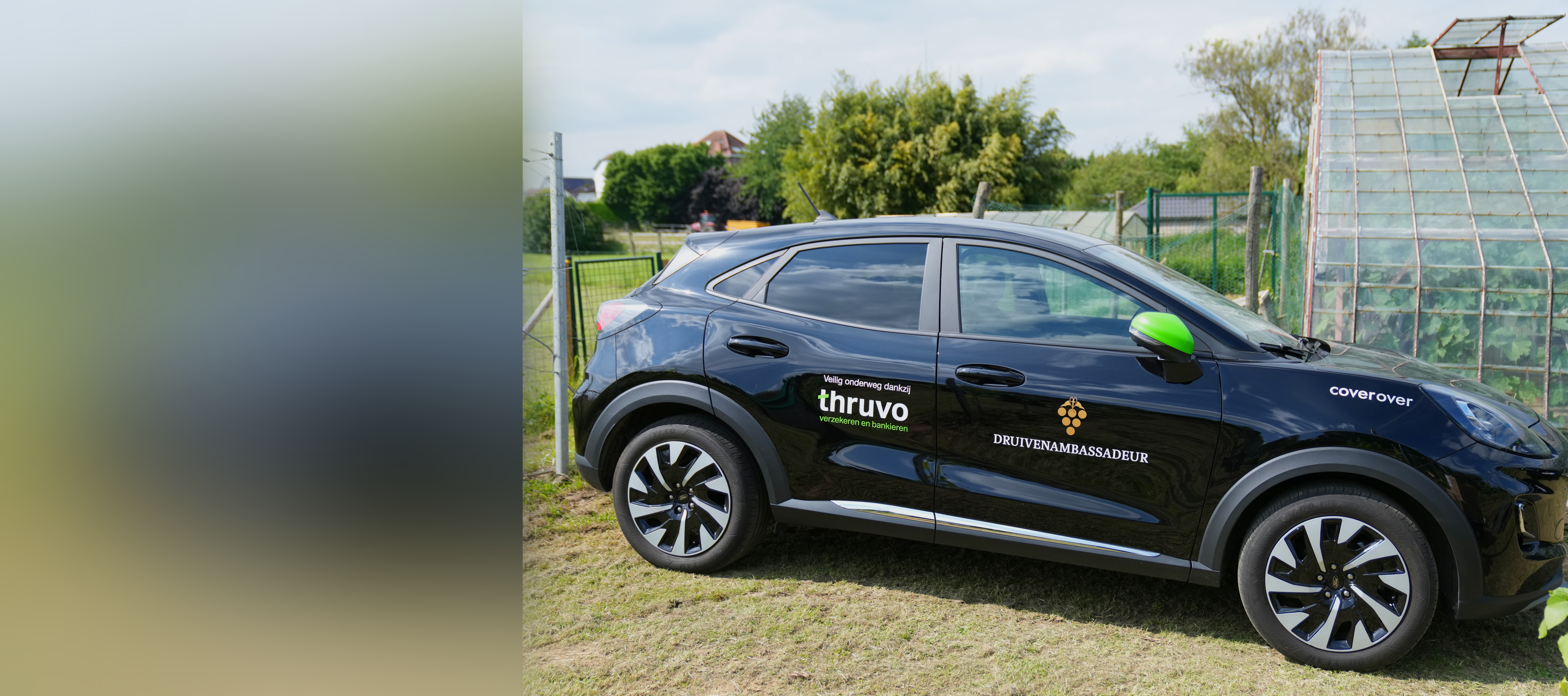
The t of thruvo has a green stroke you recognize even without the word. It sits on the door of every car and on the deckchairs.

A visual identity as a system.
Two greens, black, one typeface and a steady tone of voice: your point of contact. Every design works from there, from the team shirts to a holiday greeting.



On the street.
The visual identity had to work outdoors, on cars, beach flags and deckchairs, so the new name stands out on the street.


The launch.
On June 7, 2024, the banner was unveiled in a greenhouse full of vines. The owners introduced Thruvo to customers and partners, and the day was photographed for everything that came after.


Online.
thruvo.be brings it all together: the offices, the services and the people. The site works as well on a phone as on a big screen.


What it changed
24 applications of one visual identity, from invitations and fence banners to folders and job posts. A reel in the new style reached almost 6,000 views in August 2026.

Want this for your business?